


Pinterest Redesign
PINTEREST NEW FEATURE

Overview
Main objective of this exercise is to research, analyze, conduct interviews about the Pinterest interface. Through our findings, major user needs, pain points and problems with the application will be discovered. This allows us to design a new feature in hopes of consolidating those issues and make Pinterest users better allocate their time and resources to reach their goals.
Role: UX Researcher, UI Designer
Tools: Figma, Adobe XD, Pinterest
Team members: Katrina Florendo, Hao Wei Fu, Nubia Teklu, alongside Prof. Carol Smith (faculty of HCI) at CMU.
Timeline: February 2022 - March 2022

💡Goal💡
Implement a new tool by re-inventing Pinterest’s organization interface, for better sorting and maintenance of pins for all types of users.
🔄 Process 🔄
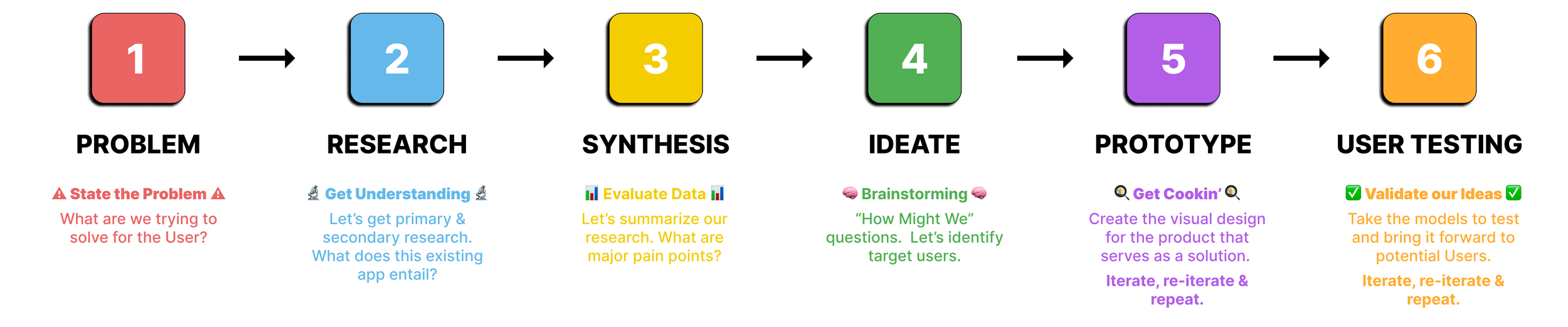
LET’S GET STARTED 🏎

⚠️ Problem Statement ⚠️
Hundreds and hundreds of pins are being carefully curated, selected then saved on the daily. Most users just save the pins and end up forgetting about them. How can we promote better “pinning” in terms of accessibility, organization and content curating?

The first step in this process is to understand where is the design integrated into? → Pinterest. Started by asking the right questions…
❓Who are the targeted audience and type of user?
❓What are the current Pinterest users thinking?
❓What are Pinterests current design flaws?
❓What are the practices when curating a Pinterest feed?
Secondary Research
Started with some preliminary research on Pinterest as a curation and inspiration tool. It is important to know what kind of tools, features and functions Pinterest currently has; based on that knowledge, it correlates to its current design flaws. Research on the overall best practices are implemented to understand what features are successful in the app. Target audience and user typologies are researched, to understand the main targeted audience and who is actually using this app.

🚫 Pinterest’s Design Flaw
Many users are frustrated with Pinterest’s organization of content - both photos and videos are shown; especially when users only want to see photos.
Also complained about a misleading interface, many asked - how do I even distinguish ads from pins? why are we forced to have a “shopping list” board?
Lastly, content creators have been hesitant about Pinterest’s ability to protect the originality of their work. There has been cases where Pinterest has used content creator’s images for commercial marketing without consent.
🌟 Best practices
🗣 “Advertisers should clearly distinguish advertising, public relations and corporate communications from news and editorial content and entertainment, both online and offline.”
🗣 “Users like being able to subscribe or follow boards or users they’re interested in”
🤳 Who are the Primary Users and Demographics?

The primary audience Pinterest targets towards are general creatives and people looking for inspiration. Used also academically within institutions for students and professionals working on projects. Finally, corporations and various businesses utilize Pinterest for social media markets.
The majority are female users, however their age varies quite evenly, 32% of Pinterest users are 18-29 years old, 34% of Pinterest users are 30-49 years old and 38% of Pinterest users are 50-64 years old.
Primary Research

Interviewee Age: 19
Interviewee Title: Pinterest User, Student, Artist

Interviewee Age: 19
Interviewee Title: Pinterest User, Student, Artist

Interviewee Age: 21
Interviewee Title: Pinterest User, Architecture student, Aspiring interior designer
Highlights & observations from interviews
⭐️ Most of the users interviewed have used Pinterest for at least 2 to 7 years.
⭐️ All interviewees are very passionate when describing issues they face using Pinterest.
🗣 (User 2) "it’s going to take me forever to organize [my pins]”. Users have a difficult time organizing their pines.
🗣 (User 3) "They have [a scanner] feature which I didn't really get how to use... It's very confusing and hard to use" Users have confusion about current Pinterest features.
Ecosystem Collection


Needed to synthesize all the preliminary research done to find major pain points of users. This determine what type of feature implementation was most necessary for Pinterest; the method of Infinity Clustering is used.

Phase 1: Gathering Information

Phase 2: Building Cluster Infinities

Phase 3: Organizing Data into a Logical Story
After clustering all the sticky notes based on the initial primary and secondary research, we generalized topic headings that pertain to each. This allows us to develop major pain points and needs of the user. We have concluded:


”How Might We” Questions
We reframed insights and pain points from the affinity diagram into “How Might We” questions. We made sure to use them to think opportunistically about solving the problem and meet the needs we’ve identified. We welcomed “outside” the box ideas, combined similar shared ideas, made sure we were not biased in relation to forming ideas.
❓ List of questions…
How might we organize content that is intuitive to users?
How might we ensure ideas and content are not stolen?
💡 How might we help users organize pins into subfolders easier and faster?
How might we distinguish photos from videos?
How might we filter between photos and videos?
💡 How might we better distinguish ads from regular pins?
How might we better deal with image search?
How might we have a clearer and more intuitive home page?
Generated User Scenarios + Context


User Studies
Based on the storyboarding exercise, we formulated targeted users that would have similar pain paints, needs and goals. This allows us to situate real people to the specific problem. Say hello👋 to:


👇
Final Focus
From the different problems we explored while creating scenarios and storyboards, we chose to focus on creating a multi-select feature going forward. This is because:
☑️ Organization is a big part of Pinterest
☑️ The users we interviewed were particularly frustrated about having a hard time organizing their pins
☑️ The multi-select feature can be applied to multiple aspects of Pinterest, such as: selecting pints on homepage or organizing pints into boards and subfolders.

Creating & Adding Interactivity

Initial Wireframes + Team Critique

Snack Bar Design
We focused on having good progressive disclosure, not overwhelming the user with too many interfaces at once. We liked the idea of having a snackbar with:
☑️ The number of pins selected
☑️ A “save” button to take the user to a “save to board” dialog
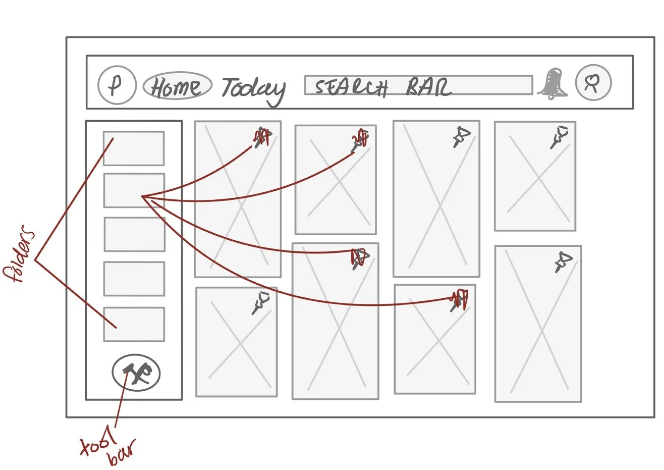
Toolbar Design
We wanted a prominent button to turn on the feature, one that the user can navigate to on first glance.
☑️ We tested the button in a sidebar with a list of boards. Making it a different shape makes it stand out.
☑️ We also experimented with “inside folder” interface that contains all the saved pins of the same categories.
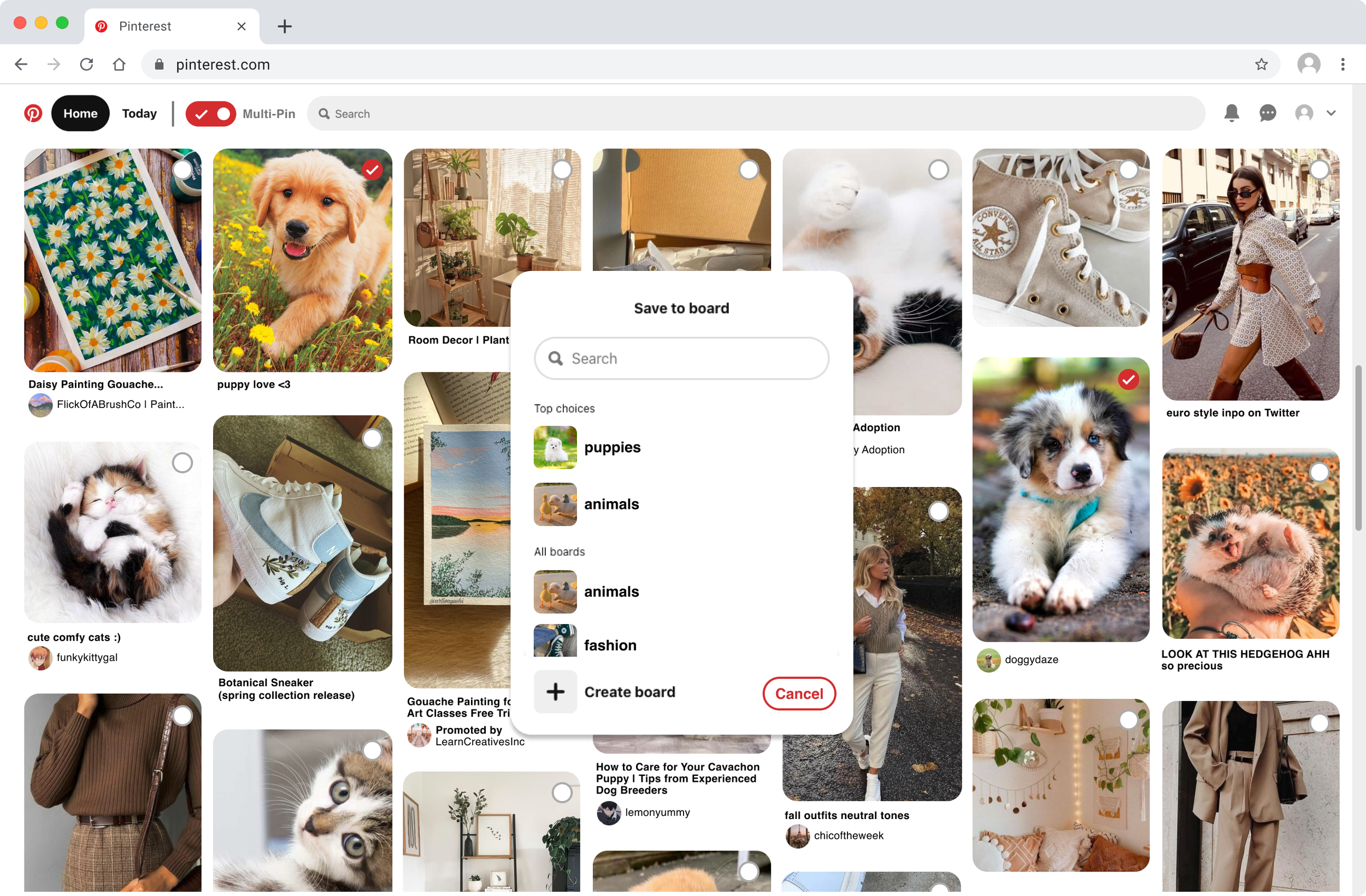
Final Lo-Fi (Multi-select “Toggle” Tool)

Multi-select tool on Home Screen bar (toggle turned off)

Save the desired pins to the desired board (board create option available)

Multi-select tool initiated (toggle turned on shown in red)

Confirmation (with an undo button if needed)

Select the desired pins that want to be saved (will be highlighted)
🌟 Introducing the Toggle Tool Bar for multi-select!
For this new organization feature, a multi-select tool would be the most useful for pin organization. This allows users to continuously scroll and curate images while organizing them into saved boards. We chanted to a “toggle” instead of a button to activate multi-select. It’s more intuitive to users since a toggle mimics a switch that can be turned on/off.
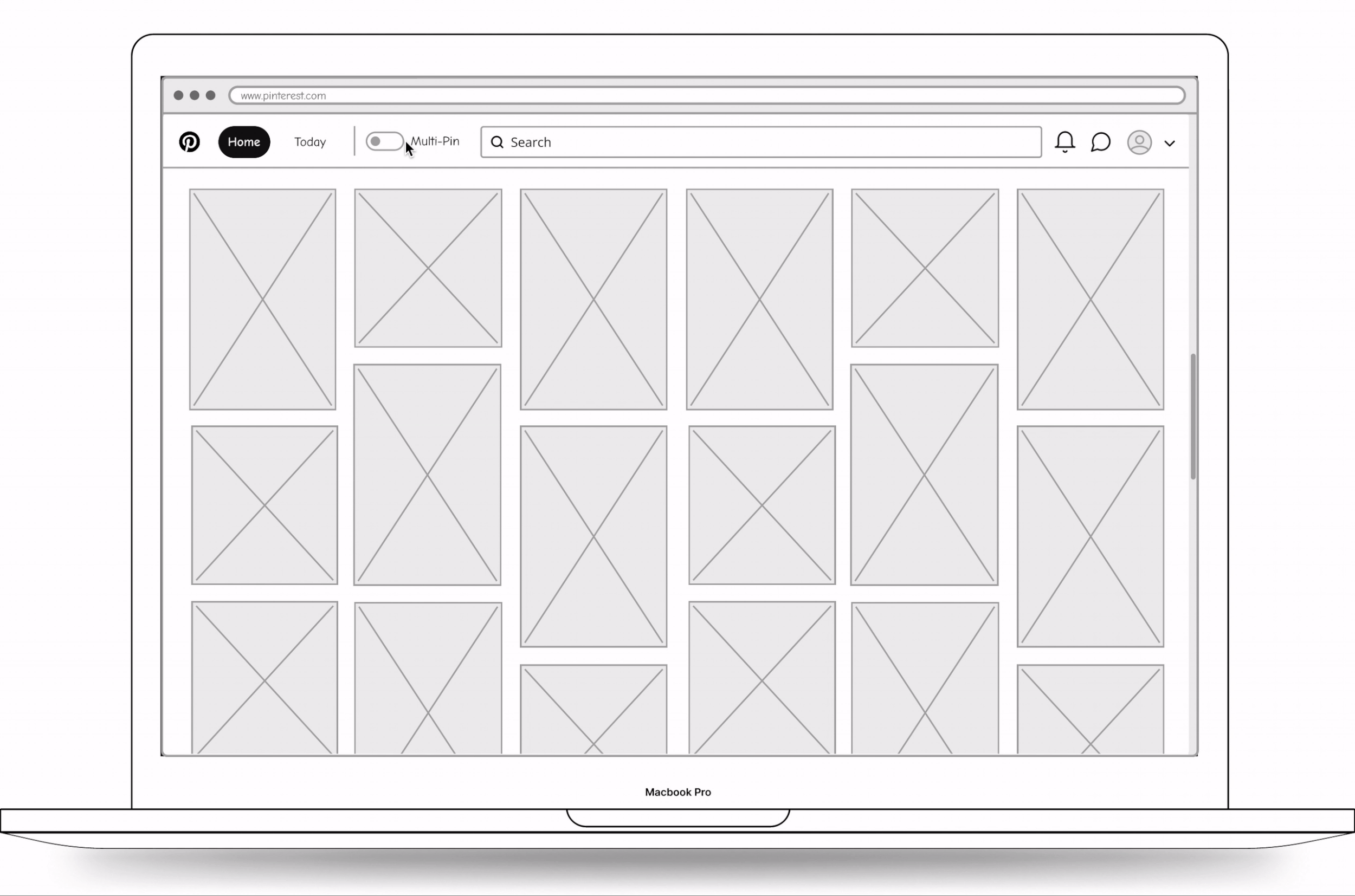
Mid-Fi
🖥 LET’S DIGITIZE!
Changes from Lo-Fi → Mid-Fi
Mimicking the proportions of Pinterest’s homepage to get a better sense of how the feature would look when implemented.
Adding a “Multi-Pin” label to the toggle button so users know what this is for.
🔎 FIRST FEW TESTS LATER…
Changes from Mid-Fi → Hi-Fi

Hi-Fi
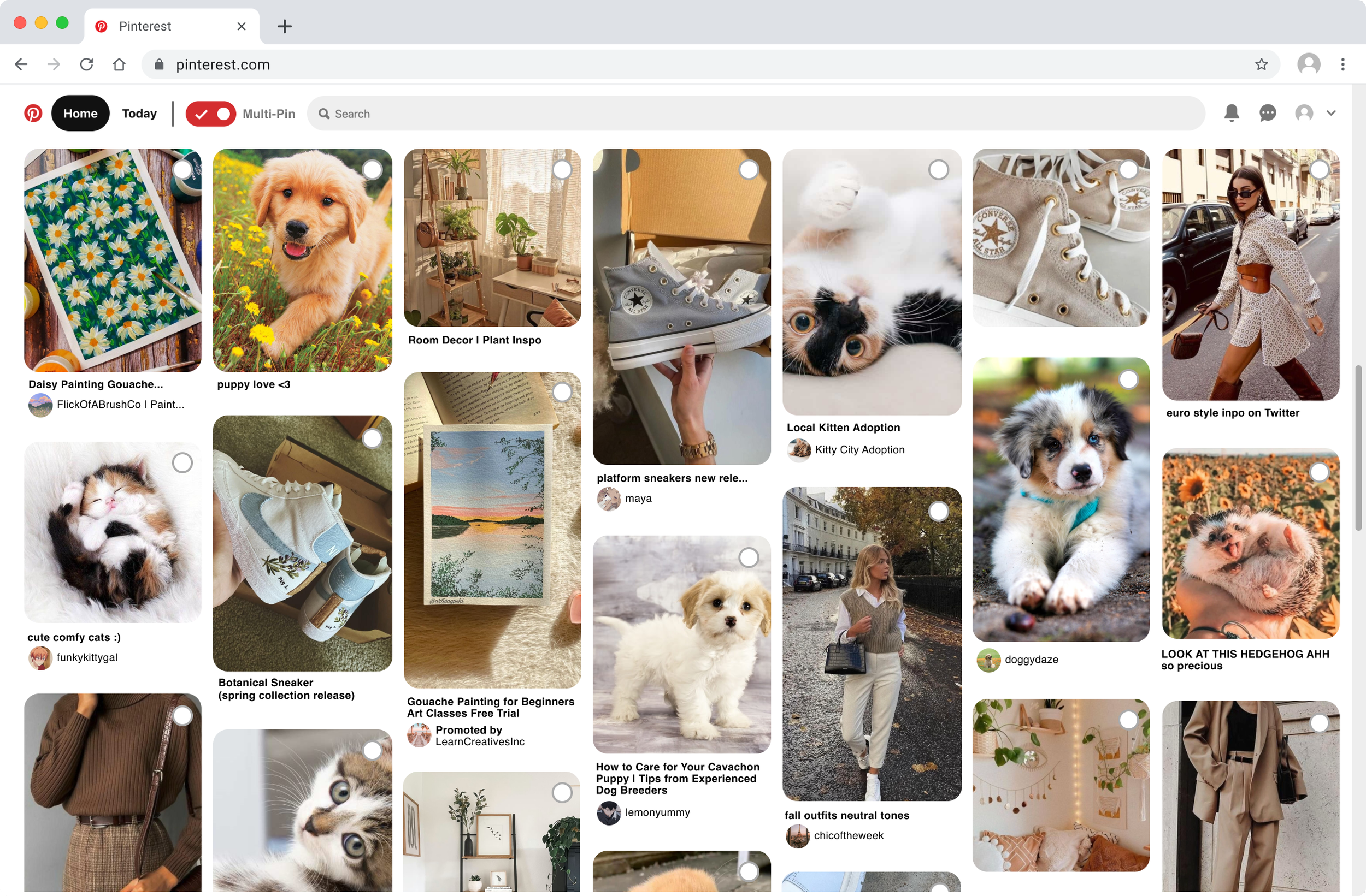
Multi-Pin toggle mode ON
After clicking on “save” the user can select the desired board to save to

Select desired puppy pins

Confirm with “OK” , “Undo” will go back to “Save to board” interface.
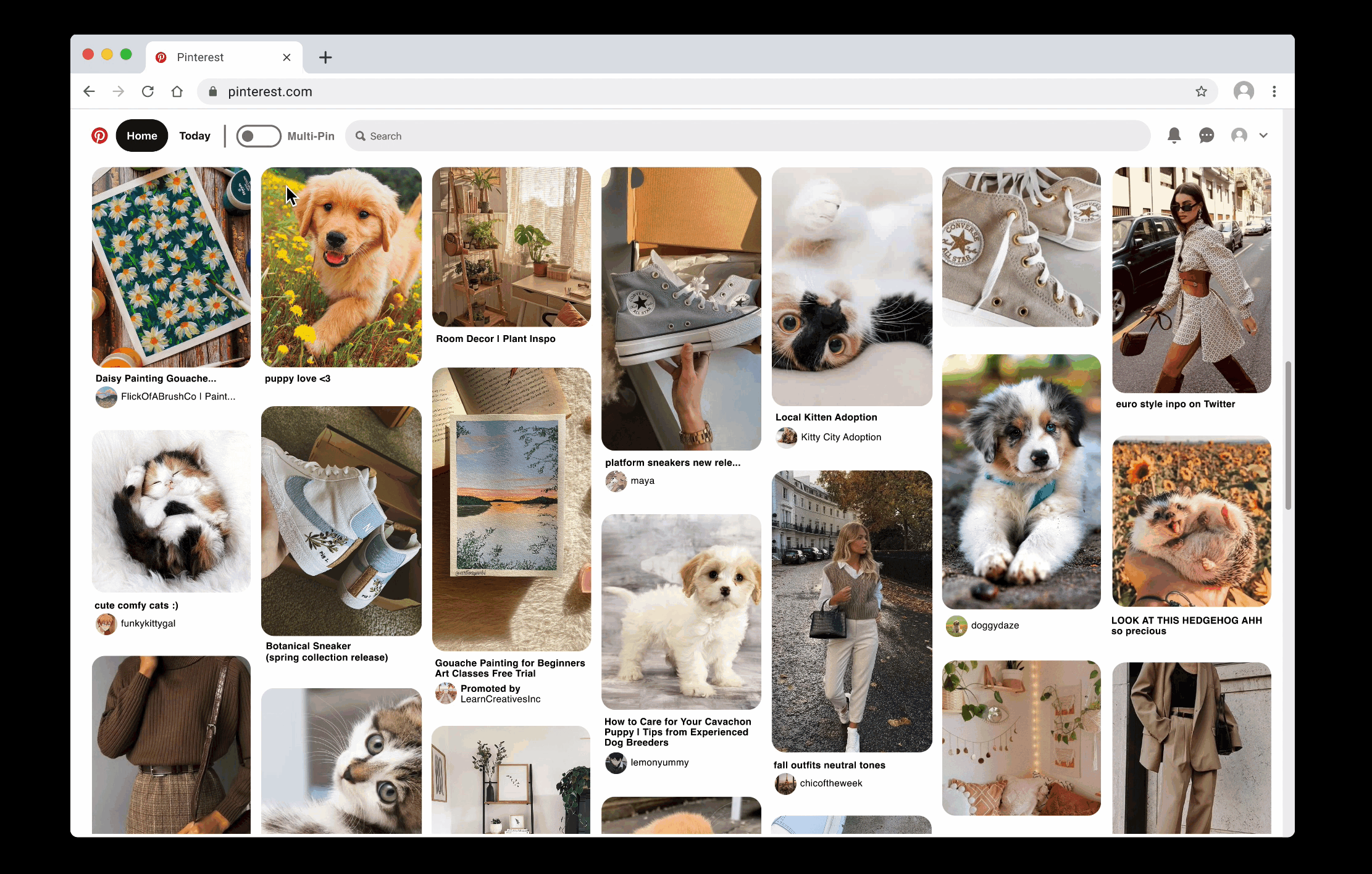
Before & After

Before (Original Pinterest)

After (Multi-Select Feature Implemented)

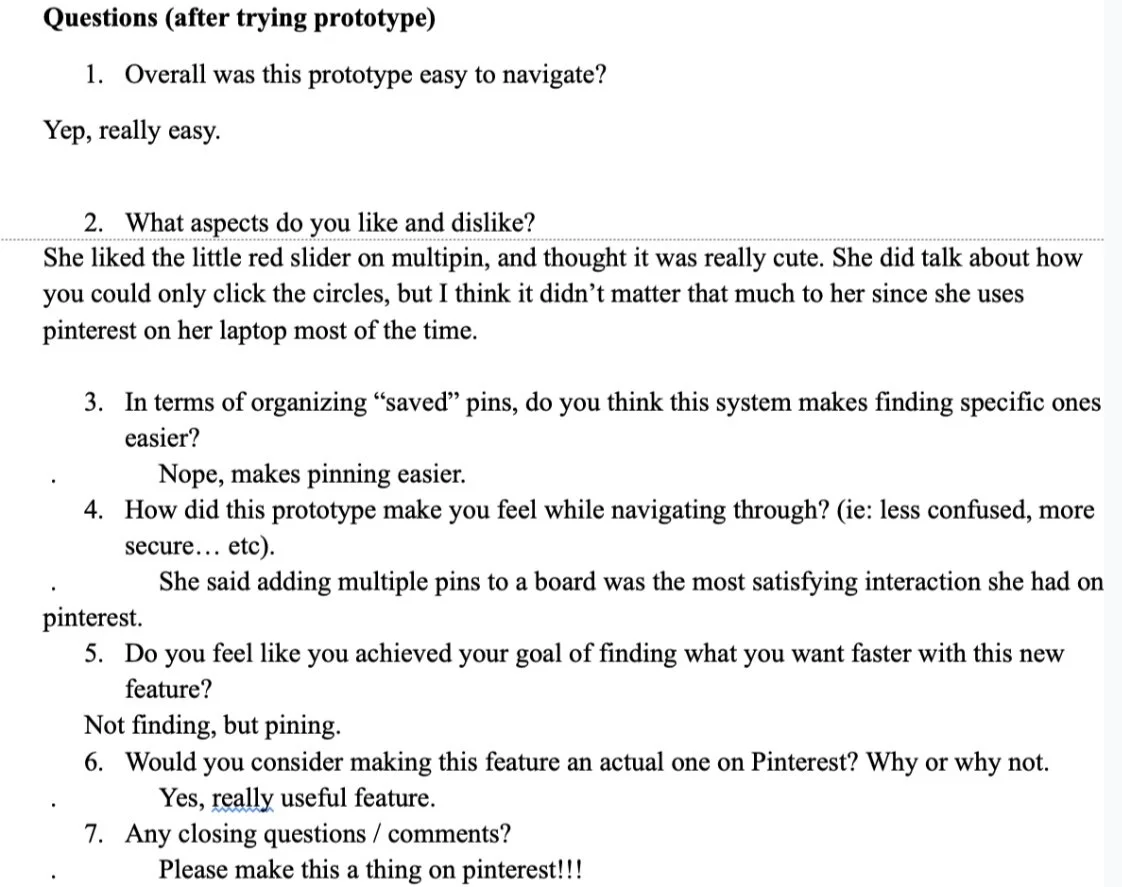
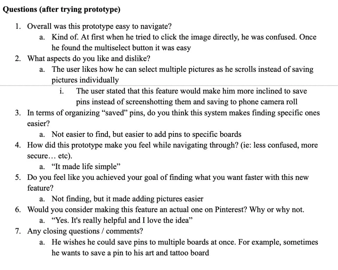
Usability Testing
After implementing the Hi-Fi prototype, we seek out the validity of our implemented feature. We conducted a few rounds of user interviews and testing. We first recruited participants who were representative of the primary end user, and made sure they were not HCI or design students. We ensured that they were people who use Pinterest pretty regularly, and they were happy to provide feedback about the product.
Sample Tests

Interviewee Bio: Female, 23
Interviewee Title: Journalist / Photographer, Craft Hobbies
Frequent user: Yes

Interviewee Bio: Male, 22
Interviewee Title: Computer science student, Adventurer, Foodie
Frequent user: No
💡Final Feedback Received
☑️ Implementing the ability to save selected pins to multiple boards
☑️ Increase the border for click detection on a picture rather than just the small circle on the top right.
☑️ Expand area for user to click and save selected pins to a board
Instead of expecting the user to only click the save button, they should also be able to click the name of the board/surrounding area
We revised our prototype after the first interview to maximize unique responses in the remaining 2 interviews.
⏭ Next steps…
What does this mean in terms of Pinterest as a whole? Now it is time to explore how this tool can impact the other features Pinterest would have to offer. We will have to look at this in a much more realistic sense — does this clash with the rest of the system? Does this replace another important feature?
📚 Take Aways
We have identified the user type, their needs, interviewed their experiences and gathered background information; I was genuinely surprised on how this process can really push the way we design the prototype. Another thing I learned is the importance of doing multiple iterations of the prototype. This is why it was very beneficial to start with Lo-fi then Mid-fi and eventually Hi-fi; therefore we can go back and forth from testing / interviewing and re-adjusting the prototype.
Since our main “problem” that we are trying to tackle is for users to have a better experience with tackling organization of pins and folders. One way the information can be misused is perhaps being way to strict on how users can organize their pins. As many users actually prefer the “disorganization” aspect, where they can see a cluster of information right away instead of information being sorted. This may bring them more inspiration in some aspects. Therefore we felt it was important to create a “multi-select” mode, where users can toggle on and off (just incase, they do not actually want to organize everything at that moment).