


Nile
E-COMMERCE WEBSITE DESIGN

Project Overview
Website design to promote e-commerce app: Nile. Nile connects customers to local businesses through package pick ups, while preventing package theft. The website promotes, educates and story tells Nile’s goals, strategy and overall app. Let’s go check out Nile!
Role: UI / UX Designer
Tools: Figma, Adobe XD, Miro
Team members: Elise Wang
Timeline: December 2022 - January 2023

💡Goal💡
We are aiming to create a more pleasing and engaging travel experience through a mobile-based application which provides route recommendations that satisfy the travelers’ needs and preferences.
🔄 Process 🔄

LET’S STOP PORCH PIRACY! ✋

⚠️ Problem Statement
How can we provide users an informational service to allow for a “sneak peak” and understanding of Nile’s offerings, while promoting them to download?
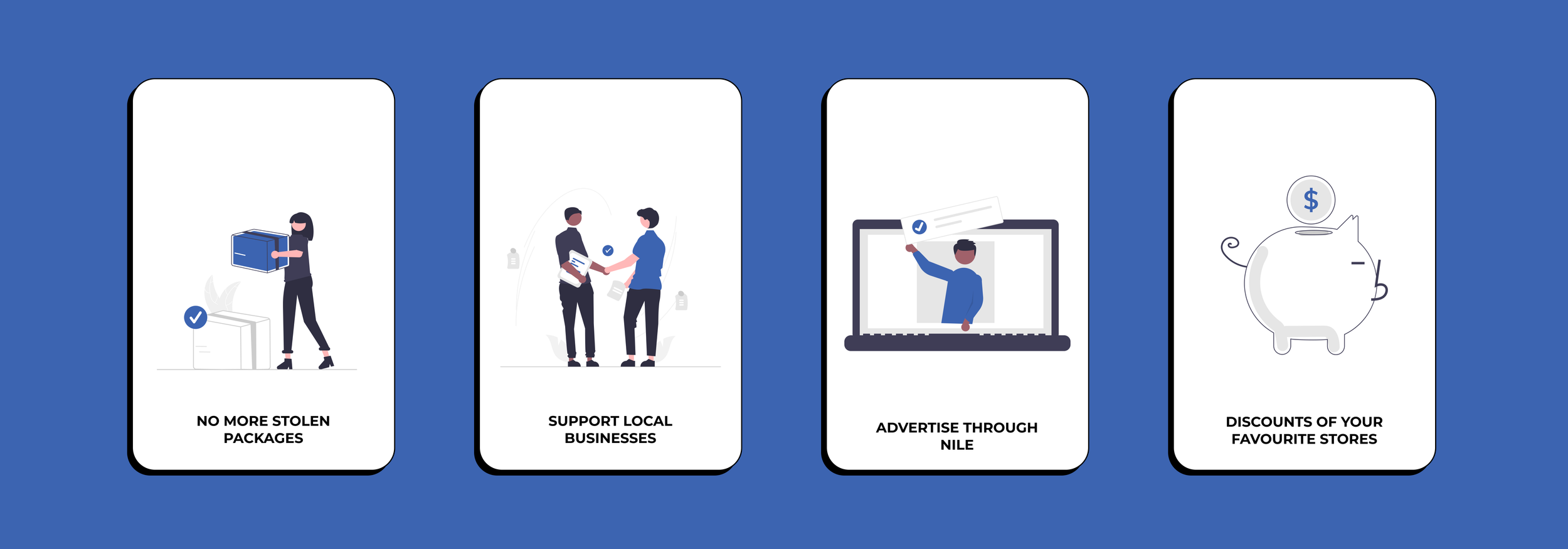
Here are the 4 main benefits of Nile’s platform — we need to ensure that the website design caters to these factors and that these factors are communicated clearly to users who is new to the app.

📦 What is Nile?
Prior to begin designing a website for a service, we need to understand it. To effectively promote, showcase and onboard new users, we need to understand Nile’s main objectives, process, targeted audience and market research.


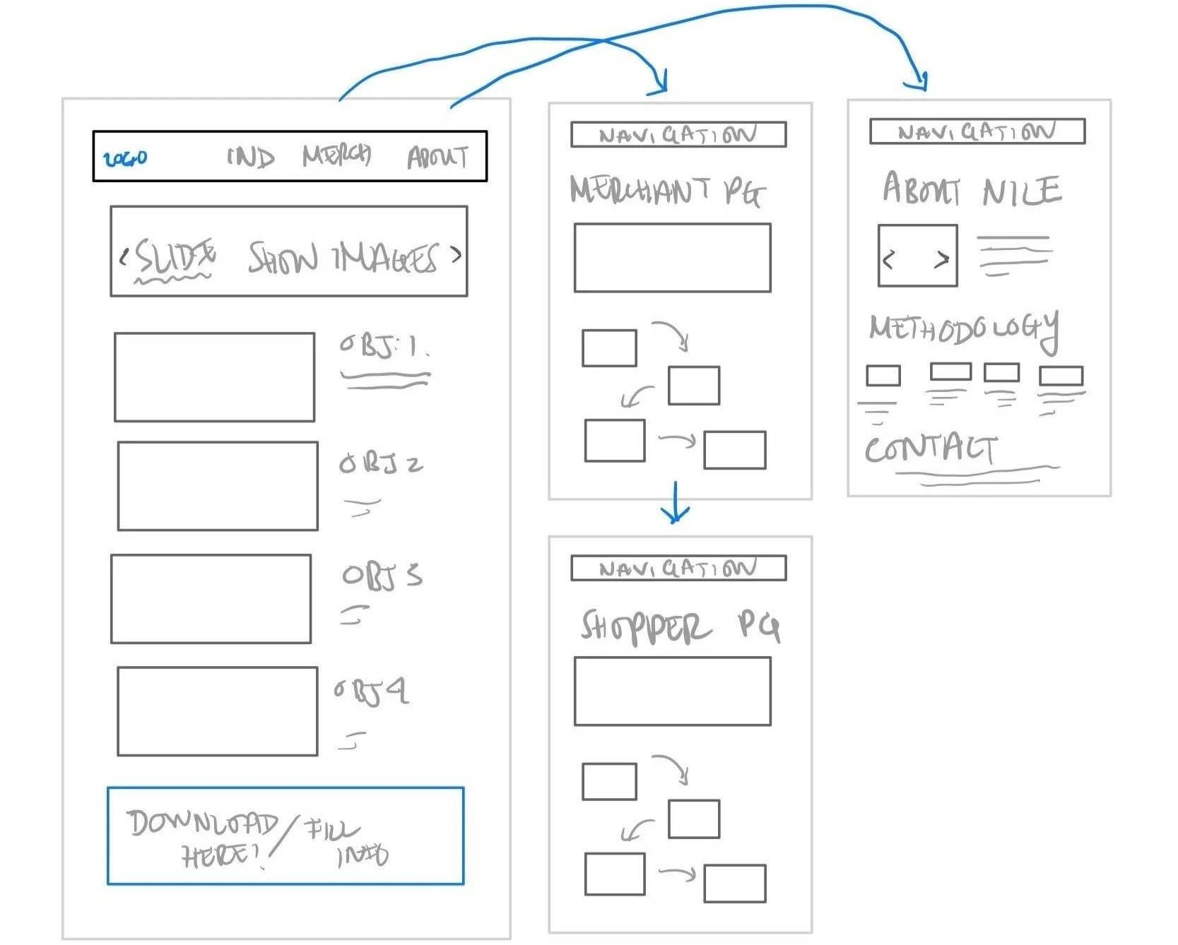
Preliminary Interface Flow
We started with the informational architecture — the overall flow of content of this website. We knew there was 2 main parties of this service: “The Individual” (shopper that collects their packages) vs. “The Merchant” (business owner who receives packages). 2 main sections are needed to tell the story through their perspectives. Additionally, a home and about page is needed to highlight Nile and the service they are providing.

⭐️ Pages & Content
Home Page
Key Goals & Objectives
Prompt users to Individual, Merchant, About pages
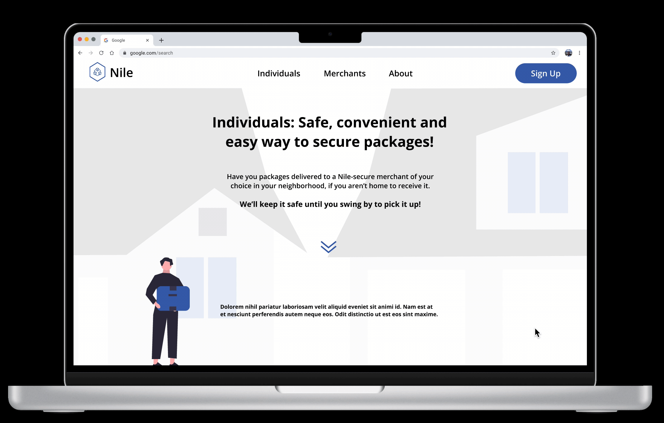
Individual / Merchant
Introduction of both user types
Journey map on how it works
Key highlights
About
Objectives, goals and directive of Nile
Stakeholder / market / customer research

Lo-Fi
🍳 LET’S GET COOKIN’ !
For the first stab at prototyping: we started with rough sketches of specific elements that is needed for the website to showcase. Since e-commerce and the business model of individual consumer related to local businesses can be complex — a visual strategy of applying that information needed to be developed.
Sketches
Proposed pages
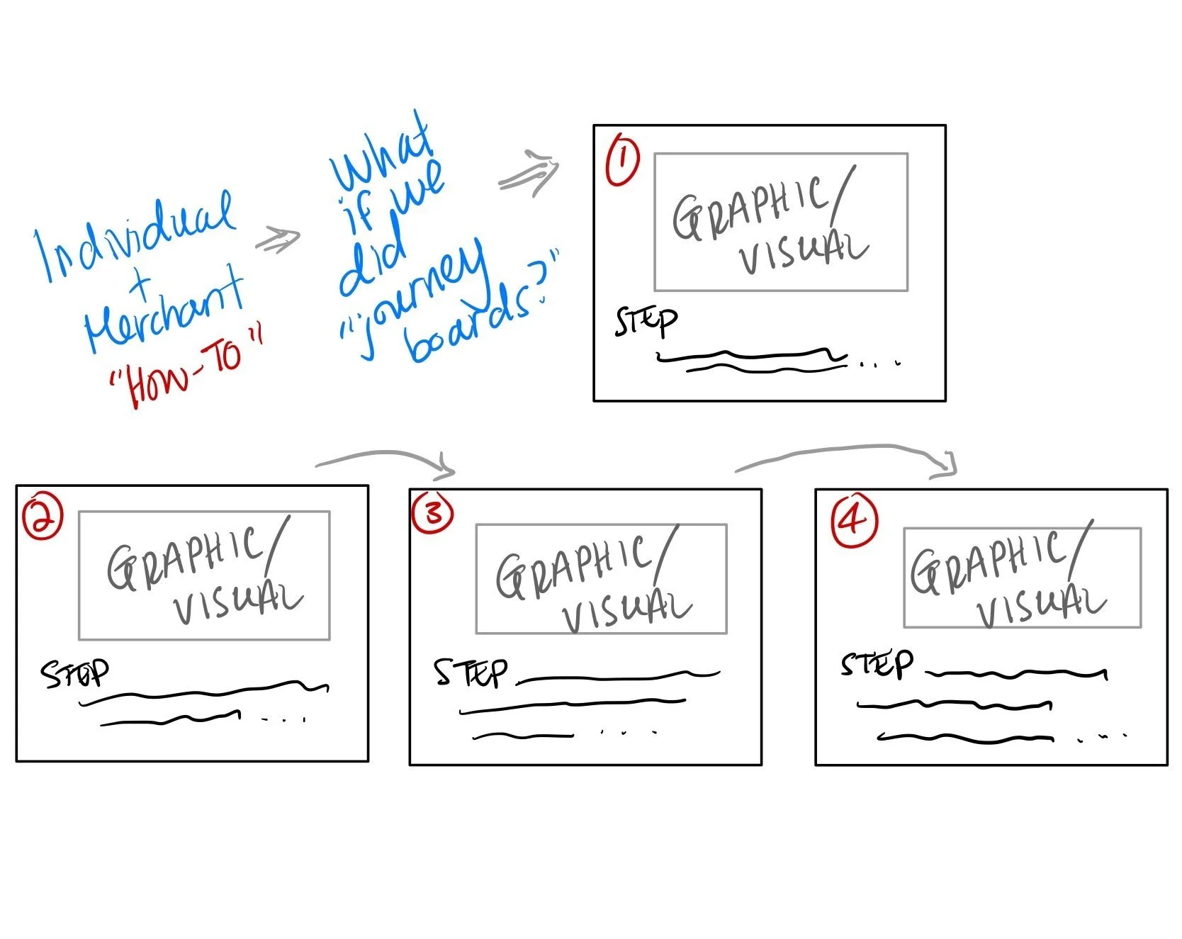
Individual / Merchant OnBoarding Journey
Wireframes


Hi-Fi
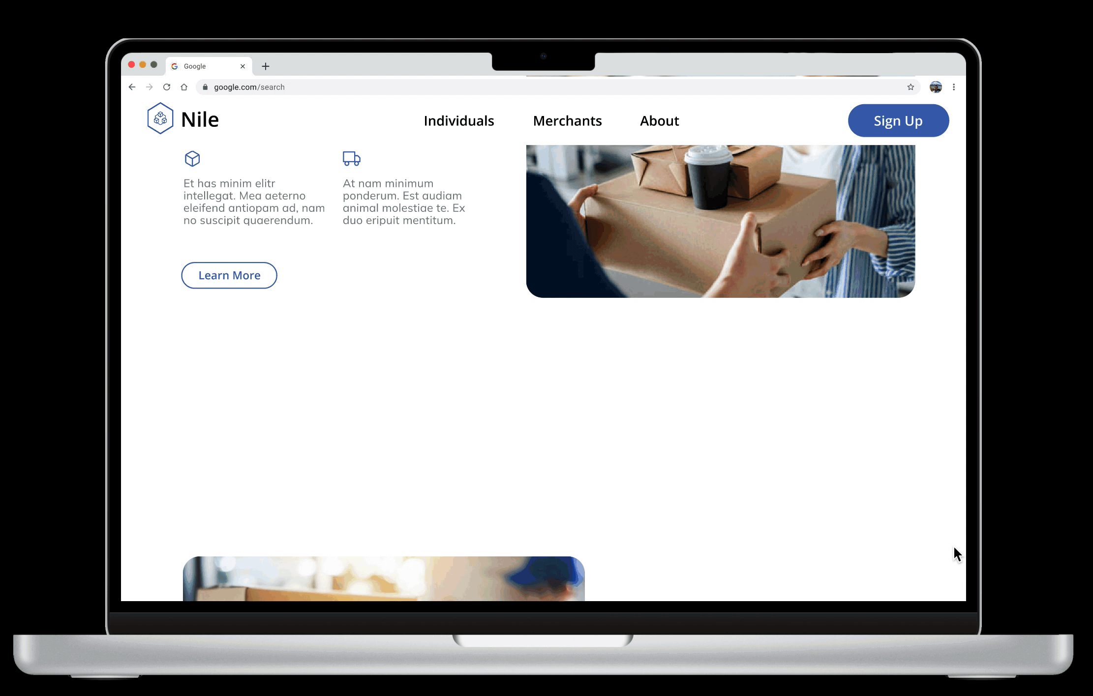
🎨 LET’S GET SOME COLOR IN HERE!
The color palette is kept quite clear, understandable and elegant.
I utilized Nile’s primary color schemes that connects to the logo — soft blues. It is paired with soft tan tones, to install trust within users. The style directly relates to the professional manner of the Nile team and easy graphics allows the information to be visually graspable.

Home & Individual Screens

Merchant & About Us Screens

Adding Interactivity
Home Page:
Each scroll allows users to see Nile’s 4 main objectives — this promotes user downloads. Additionally each insight connects to either: The Individual (shopper) or The Merchant (owner) leading users to further explore/.
Individual Profile Page:
Journey map of how it works, benefits and main objectives of the shopper who wants to pick up a package at their local business. Visual key graphics and summarizes each step and helps guide users through the process.
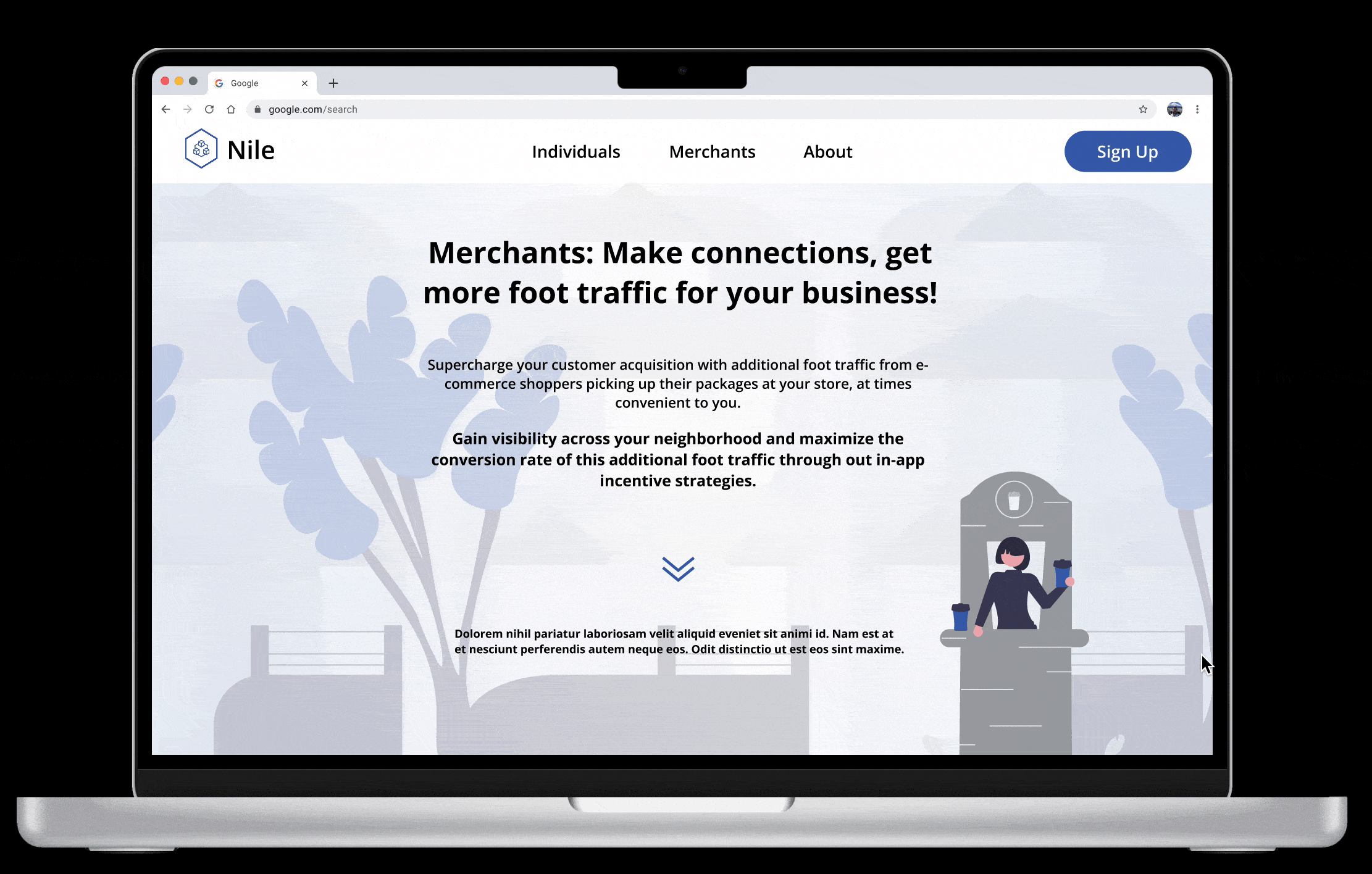
Merchant Profile Page:
Similar to the Individuals page, steps are presented upon each scroll. This allows users to easily grasp “How it Works” one by one. 3 main highlight cards are located at the bottom to re-assure users on Nile’s benefits.
⏭ Next steps…
This website is still in the works to connecting to the actual app. However, based on feedback further iterations to connect to the web application itself should be explored. Such as providing a platform for onboarding for the app itself, that can simplify that portion for users and perhaps increase overall usage of the app.
📚 Take Aways
This website design process made me realize the importance of understanding the client and actually utilizing the app prior to planning for screens. However, it is also beneficial that I was trying to understand the intricacies of the e-commerce platform from an outside perspective — as a typical user. This allows me to best understand how I can make the process, objective and highlights of the app to be tangible.